Kaci here! In March and April the Hideout Theatre is putting up a production of Hitchcocked! improvised tales of suspense and intrigue in the style of filmmaker Alfred Hitchcock.
For the set we decided to go with a Saul Bass-inspired design, a graphic artist who made many popular posters for Hitchcock films.east Inflatables
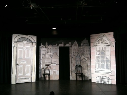
I started here, with the Charles Dickens Unleashed! set. We had it up November through February (Austin Secrets didn’t have a specialty set, which was fine).
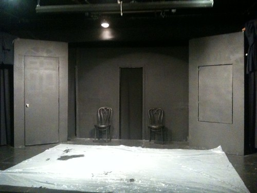
First I painted everything black. No primer this time – what? (I bought paint and primer in one!)
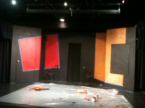
Then I added in orange and red blocks of color.
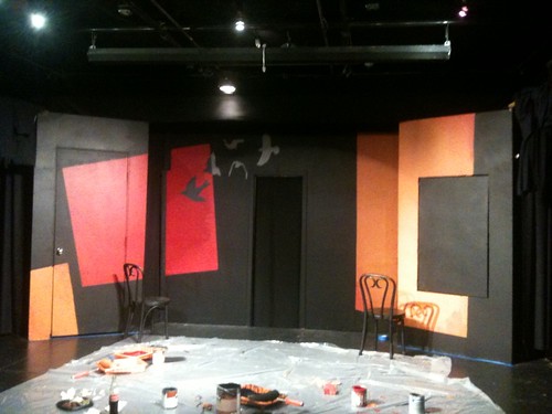
Then I painted in bird silhouettes and added some depth to the three color blocks.
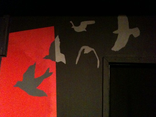
Birds up close.
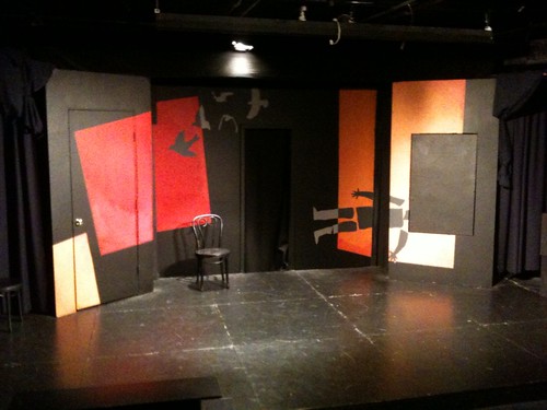
Today I came in, cleaned everything up (added extra coats where needed, trimmed things) and added a stylized dead body.
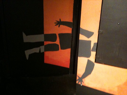
The body up close.
Simple. Dramatic. Stylized.
Mission accomplished.
These photos don’t represent detail or color very well, but with the iPhone it is so easy to take photos on the fly. I’ll have to get a photographer friend to take better ones for me.
I think the directors have plans to put a white scrim behind the window unit for creepyawesome shadow-effects.
So far each set we’ve had here at the Hideout has been fairly distinct from one another. I wonder what we’ll want to do in May/June for the 1950s sitcomesque show The Andersons. Time flies so quickly, I’m sure I’ll be painting over this sooner than I think.
Catch the new set and Hitchcocked! before they’re gone!
-Kaci Beeler
Director of Design
Kaci knocks it outta da’ park again! Really cool set; I love the birds. Anyone can come up with dead bodies and knives and such, but a stylized reference to a specific Hitchcockian thing … wonderful.
When I hear 50’s, I think women in spiked heels, tiny aprons and HUGE skirts (knee length) doing something domestic; also cars with fantastic fins. Everything was clean, clean, clean and the colors tended to be primary. Of course, that’s the 50’s I grew up in; your artistic vision may be completely different.
I think Hitchcock fans will enjoy this!
This design is fantastic – it was just what I was imagining, being one of the directors of the show. Evocative of a tone and mood, somewhat abstract, not specific. Saul Bass liked abstractions to suggest ideas, emotions, psychology. The poster for Vertigo, which has no real people, suggestions falling, dual identity, and male attempting to dominate female. The title sequence for North by Northwest starts out with lines forming into a grid – could be anything, but suggests coordinates, a map, movement. Later, the lines move from abstract to concrete as they become the windows and floors of an office building.
Since this show can take place anywhere, the abstraction is perfect – we sense foreboding, we get the birds imagery, and the stylized body is comedic and pointed at the same time. I love this design. I want to marry it. Thanks, Kaci, for introducing me to my future wife.
What a magnificent art!!!!!!!!!! What a creative thinking. I can’t say anything except “Great”..